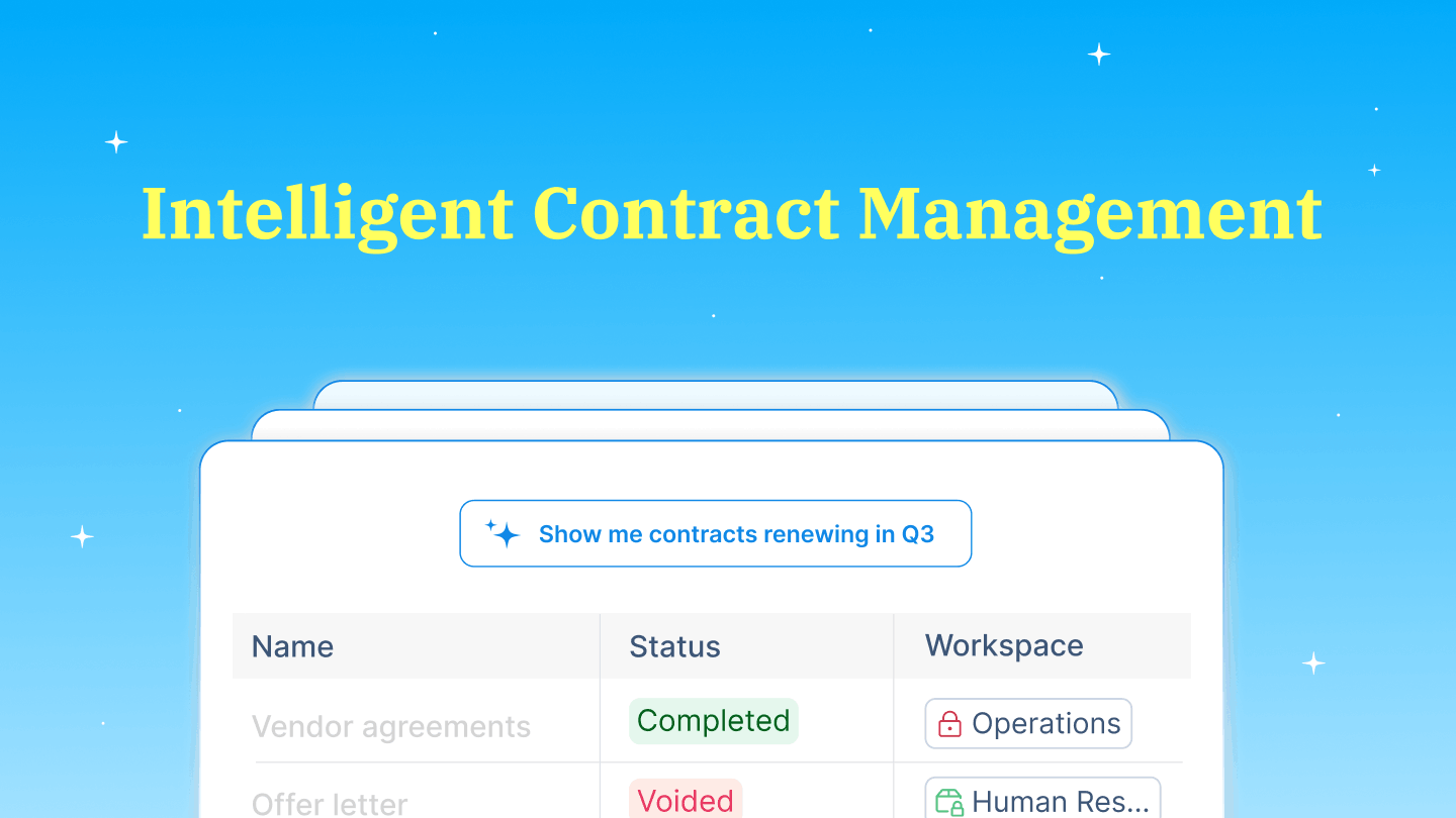
Our story began with a simple observation: contracts are broken. The processes around them are slow and tedious, and often delay critical decisions, whether for individuals or businesses.
We imagined a world where contracts wouldn’t feel like a roadblock but a natural part of getting work done. Something effortless, fast, and stress-free. Fueled by that vision, we set out to build something more than just another software. We wanted to create a product that truly simplifies life for businesses while staying true to the people behind them.
That belief isn’t just reflected in what we build. It’s at the core of who we are.
Our essence: a creator and caregiver
At Signeasy, we see ourselves as both creators and caregivers — two identities that shape everything we do.
As creators, we are driven by curiosity and innovation. We are always looking for new ways to make contract management simpler, faster, and more intuitive. Whether it’s refining the smallest detail in our product or rethinking entire workflows, we push the boundaries of what’s possible.
As caregivers, we lead with empathy. Technology should make life easier, not more complicated. That’s why we focus on building solutions that feel effortless while always putting our customers first. We want them to feel supported, valued, and empowered every step of the way.
But this way of thinking doesn’t stop at our product. It shapes how we build our company. We nurture talent through mentorship, learning opportunities, and the freedom to experiment. Collaboration isn’t just encouraged. It’s part of how we work, with open communication and cross-functional teamwork at the core.
We also believe that great work happens in a culture of trust and support. Whether it’s empowering teams to take ownership, creating an environment where ideas can thrive, or celebrating the people behind the work, we are intentional about how we grow together.
Because at the heart of Signeasy, it’s always about the people: those who use our product and those who build it.
Our identity: designing for an evolving business
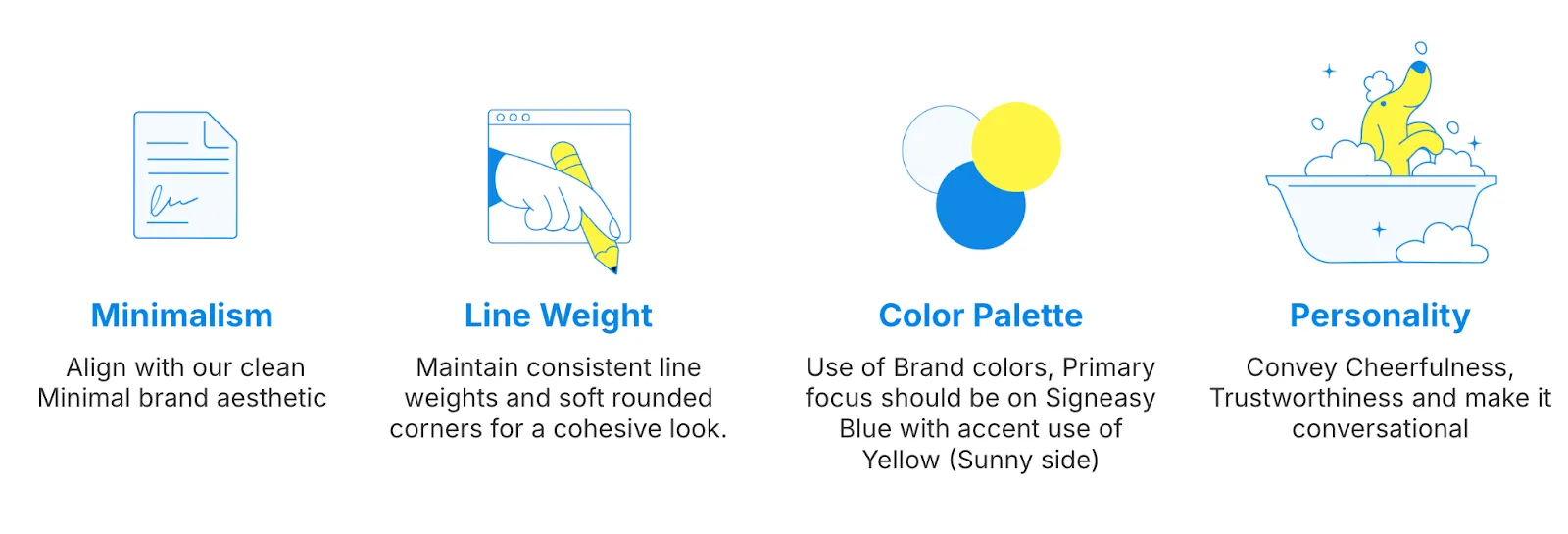
Colours that spark freshness
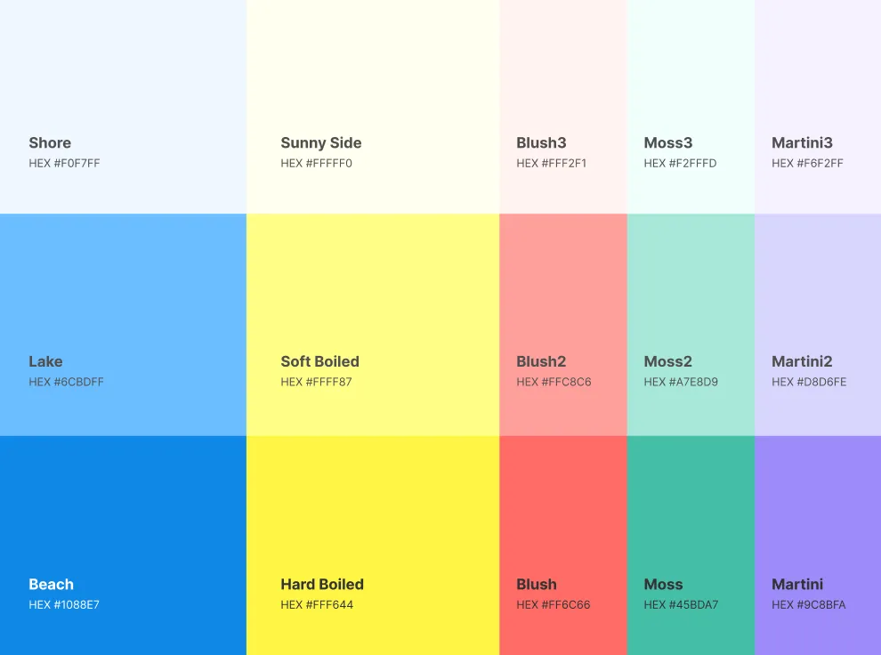
We gave our brand a glow-up! But it didn’t happen overnight. It took multiple iterations — throwing every color onto the canvas, experimenting with vibrant palettes, and stretching the limits of our brand expression.
But here’s the thing: not all colors play nice together. We loved the energy that bright colors brought, but they clashed with our signature blue, making things feel visually overwhelming instead of cohesive. So we took a step back. Instead of forcing bold contrasts, we refined our approach, creating a balanced palette that enhances clarity, consistency, and recognition in an increasingly crowded market.
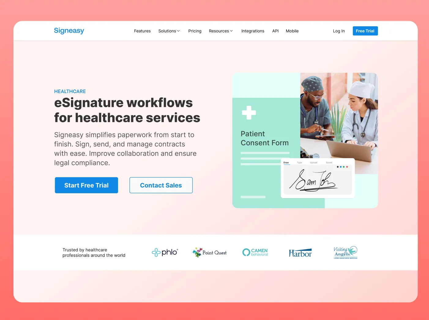
To bring in a fresh spark, we introduced yellow. It’s the perfect highlight color, adding warmth, optimism, and just the right amount of vibrancy. It’s a small detail, but just like our product, the right details make all the difference. Think of it as the sunny side up alongside your morning coffee — subtle, but game-changing (because protein!).
Imagery: a reflection of care and confidence
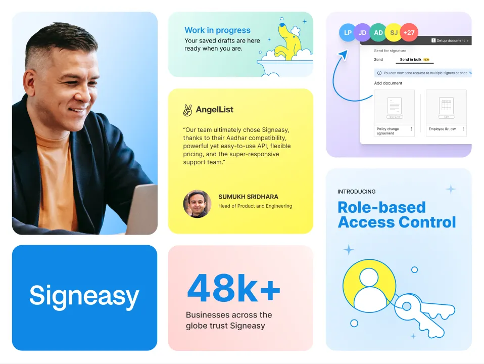
Beyond color, we took a fresh look at our approach to imagery. Every image we represent is meant to radiate warmth and exude confidence. Isn’t that what a true caregiver does?
From product visuals to website design and marketing campaigns, we focused on showing images of people who feel effortless and inviting. We want every interaction with Signeasy to evoke the same sense of ease and positivity, helping our customers feel empowered, supported, and in control.
When businesses engage with our brand, they shouldn’t just see a product. They should feel a sense of trust and be represented in every detail. Visuals aren’t just about aesthetics. They are also a medium for feeling and expressing the same emotions.
Illustrations: where creativity meets functionality
At Signeasy, our illustration system is more than just aesthetics — it’s a perfect blend of creativity and functionality. It is designed to enhance clarity, consistency, and adaptability across digital mediums. Our style is organic, characterized by linework, thoughtful contrast, and humane elements.
The line-based designs convey movement, mirroring the effortless nature of a signature, while the humane elements symbolize expression, creation, and action — reinforcing our mission to empower businesses to move forward with confidence.
With the introduction of yellow highlights, our illustrations gain an extra spark of energy. The subtle pops of color add dynamism and innovation, reflecting our fresh, forward-thinking approach.
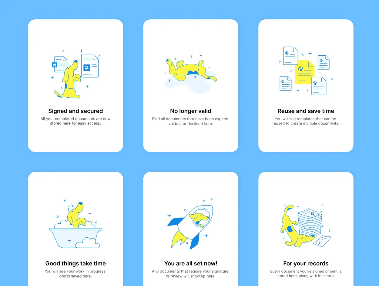
Our illustrations don’t just sit there looking pretty — they tell stories. Each line, stroke, and element is intentional, bringing our creator spirit to life. Whether in marketing, product experiences, or across every touchpoint where Signeasy appears, our illustrations make every interaction just a little more delightful.
By focusing on clarity, personality, and adaptability, our evolving illustration system continues to shape a visual language that is uniquely Signeasy — where simplicity meets impact, and creativity meets purpose.
What’s next for Signeasy?
Signeasy will be more than just a product. It will be a thriving community of businesses that believe in a faster, smarter way to manage contracts. We see the impact every day. We want teams to reclaim the time lost from paperwork and focus on what truly matters: growth, innovation, and value.
Our brand refresh is a reflection of this evolution. It’s designed to feel effortless, modern, and human, just like our product.
Every color, illustration, and visual element reflects who we are: the creator, always pushing for innovation and simplicity, and the caregiver, ensuring clarity and confidence at every touchpoint.
As Signeasy continues to grow, our brand will grow with it, adapting to new possibilities while staying true to what we stand for. And we can’t wait to show you what’s next. 🚀
Want to see our visual identity in action? Check out our brand book to explore our design principles, colors, and more.