The mission behind the original Signeasy webapp was simple: to give small businesses around the world a more streamlined way to manage paperwork and collect signatures. Over the years, we’ve had more than 40,000 businesses use Signeasy for those exact purposes – processing signatures more efficiently, closing deals faster, and seamlessly managing their documents.
As our customers’ needs evolved with time, we noticed the emergence of more advanced use cases and complex workflows. This exceeded our estimations regarding how quickly our product would change, and our assumptions about how soon it would scale in terms of the use cases it offered. Clearly we needed to think about Signeasy's design overhaul.
THE CHALLENGE
Each quarter, we added more and more new features, all of which were well-received by our user base. This fuelled our desire to pick up the pace and include even more use cases, as requested by our customers. However, as we brainstormed about the future and turned our attention to rapid-fire development, we neglected an important step: evaluating how our user experience and underlying tech architecture were scaling to these new needs and use cases.
When we looked closer, we noticed that our new users were not importing and signing documents as much as we would have wanted. The rate at which our customer base was growing had overshadowed the fact that engagement rates were on the decline. This threw up a large red flag for us; we knew we had to take massive action in the form of a major facelift to increase user-friendliness and encourage engagement.
The last time we undertook a project of this scale was 2 years ago. Revisiting the UX of a software like Signeasy is impossible to do on a regular basis, since these projects require significant effort when it comes to designing, building, then validating your decisions once rollout is complete. Even a small mistake would cost us, both in time and revenue.
To minimize such losses, we wanted to do our best to research and investigate solutions before finalizing our decisions on Signeasy's design overhaul. Motivated by a desire to uphold our commitment to providing world-class customer care backed by an outstandingly easy-to-use product, we got to work.
THE DESIGN PROCESS
Change comes from within, as the old adage goes, so the team started compiling a list of Signeasy’s existing issues.
This multi-pronged approach included scraping a list of items that the team had flagged as subpar UX over time, including bugs, features, and recommendations on how to improve them. Now that’s collaboration.
We also conducted an analysis of some SaaS applications we admire, and how we can learn from what makes them awesome. Here are just a few of the findings that caught our attention and guided our process:
- We learned that integrating a drag-and-drop function for document fields would make the document filling process that much smoother
- Everyone likes keyboard shortcuts, we decided to use them too, to help users place document fields more precisely
- Signeasy used to have the annotation/fields palette on the right, which went against the typical “left to right” website interaction behaviour, so we switched it to the left just like almost all other software, and other products/tools in adjacent industries (eg. editing, design tools)
- Also, many of us had trouble resizing document fields on various apps, so we made a note to ensure ours would be hyper-responsive.
Our conclusion: while every product had its own unique snags, there was also a lot to learn from what they got right. A few recurring patterns helped us pinpoint areas of improvement that could set us apart, like dragging and dropping fields into a document instead of having to click in two places.
Armed with all that knowledge, plus user feedback from an early prototype, the design team was ready to move forward. Here’s how they got the job done.
Step 1: Getting organized
The first order of business was to digest the huge volume of information that had been collected during the research phase, so we created a master document where all of our findings could live. Then, we tranched the document into more manageable chunks: we made buckets for UX improvements, UI improvements, and bug fixes for each of our three core features (self sign, RS send, and RS sign).
Step 2: Triage
The design team brought in the engineering team to create a list of priorities based on three main criteria: the impact of each change, the reach of each change, and the effort required to build and test it. They used a scale of 1 to 3 to rank their priorities.
Step 3: A little help from our friends
By looping the tech team into the process, our design experts realized early on that some of the upcoming improvements required a significant overhaul of their underlying architecture. They decided to redo the entire PDF engine, shaking off some key limitations that would have boxed them in during the redesign.
***
As we continued to dig deeper into our findings, it became clear that we had a gargantuan task ahead of us: the core of Signeasy’s architecture needed to be rebuilt from the ground up if we wanted to achieve our dream of rolling out a shiny new signing UX.
We did not see that coming. And as a result, the new and improved Signeasy would take longer to send to market than we thought – much longer.
Some might have seen this revelation as a wrench in their spokes, but we took it as a golden opportunity to do things right. The design team was therefore given free reign to build the easiest and simplest signing experience on the market, revisiting the entire product from scratch.
DESIGN DECISIONS
Backed by an immense amount of research and analysis, we moved confidently forward into the decision-making phase. Here is an overview of the development and rollout timeline for Signeasy Mint.
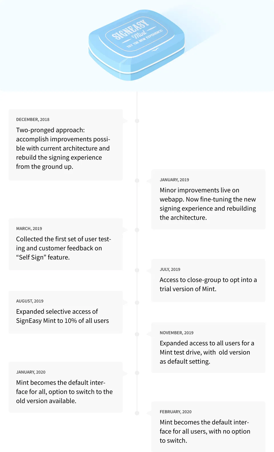
Now that Mint is the official face of the Signeasy experience, and now that our team has reworked our platform from the ground up, here are all of the changes and updates you can expect to see.
A new location for the annotation and fields palette
Since people usually scan a webpage from left to right and top to bottom, we realized it was not optimal to have our tools palette located on the right. Now that we’ve moved it to the left, users who are accessing Signeasy for the first time will see the most important information first, therefore being able to sign and send documents with ease. Most enterprise tools, like Photoshop, Illustrator, Sketch, and XD, have their toolbars located to the left or at the top of the window, so our software is now aligned with this industry best practice.
A more effective color scheme
With our old color scheme, the level of contrast between different colors was very low. For screens or monitors with low contrast ratios, colors often blended into each other, and users could not differentiate certain page elements from one another. We fixed that issue with Signeasy Mint.

In the old version, we provided the option to assign colors to individual signers for clarity, but never thought about how to optimize the experience. Not only did we revamp our 16 document field colors to make them more distinct and vibrant, but we also revised the background color to make sure all the colors popped. By making the background a little darker, it made the annotation toolbar, document, and thumbnails more defined and helped with the actual work in hand.
Larger page thumbnails
On the webapp, each page in a document is represented by a thumbnail in the sidebar. In the old version of Signeasy, these thumbnails were only useful for navigation purposes and switching between pages.

To make the thumbnails more dynamic and useful, we wanted to provide users with a “quick view” of the document content as well. This would help them navigate to the appropriate page with ease. Realistically, users can’t be expected to remember each page’s content based on the page number – but they can discern one page from another based on a visual representation of the content.
With Mint, elements like paragraphs, bullets, and titles are much better defined, and document fields (with their respective colors) show up on each thumbnail, making it significantly easier for users to find what they are looking for.
Nested annotations/fields toolbar
After we launched our special text annotation options, our palette started getting a bit too long. It featured a total of 8 fields, which meant users had to manually scroll through the palette to find their desired annotation tool.
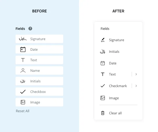
We wanted to keep the annotation list small so that users’ muscle memory would kick in when they needed to find frequently used options. Since “Email” and “Name” are text-based elements, we nested them under the general “Text” thumbnail to adjust users’ mental model of finding the appropriate annotation.
Note: the term “annotations” is a stand-in for “annotations and fields,” since we treated both categories the same way.
Drag and drop capabilities
In the last few years, touch screen laptops have become much more prominent. Following this market shift, we noticed a steady increase in the number of users using their fingers to sign and send documents, as opposed to a mouse or trackpad.
One of the biggest challenges we faced regarding touch screens was that interactions like “hover” were no longer an option. Many of Signeasy’s user onboarding elements relied on hover to be properly displayed, including interactions related to selecting, placing, and resizing annotations or fields.
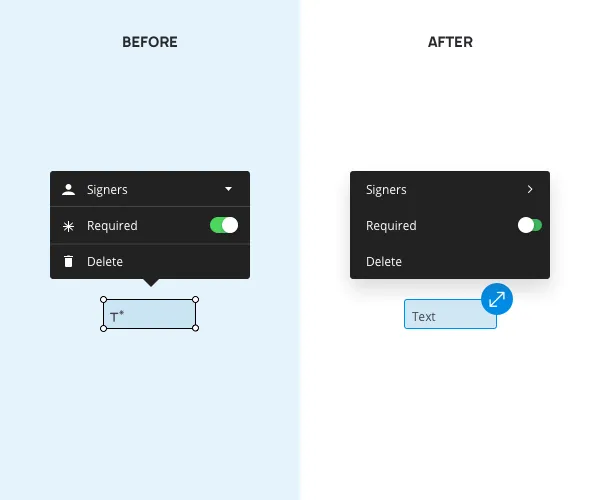
To create a more seamless user experience (especially for our touch screen clients), we moved towards a model where annotations and fields could be selected from the palette by dragging and dropping them directly into the document. The resize handlers were also updated to make it easier for fingers on touch screens to resize annotations and fields.
Document controls
Page actions can be categorized as primary, secondary, tertiary, and so on. This on-screen “hierarchy” describes which features are used most often.
We decided to reorganize the document editing screen based on this order of operations. The document controls were originally placed in the center of the navbar, giving them priority over all other actions. However, once we researched other products, we discovered that most of them kept their document controls towards the bottom of the screen, treating them as “secondary” actions. So, we went ahead and placed ours on the bottom-most part of the document window as well, with a dark background.
LAUNCH, RESPONSE, AND LOOKING FORWARD
Our primary focus during the Mint rollout was to facilitate the smoothest possible transition for all of our users. Prior to launch, using their feedback to guide our decision-making as we enhanced the Mint experience was essential to achieving this goal: it was important to involve users in the development process so that we could incorporate their desired changes early on.
To get organized, we planned out a 3-stage roll-out plan.
Stage 1 – Controlled Beta rollout
The option to try Mint out was rolled out in phases. First, we offered it to 5% of our users, then 10%, then 20%, and finally, 100% of users. Those who were given access to the Beta could manually switch to Mint if they wanted to explore the new interface. The main focus during this stage was to have actual users test out the new platform, without forcing it on them and disrupting their regular workflow.
Stage 2 – General availability with opt-out option
At this stage, we made Mint the default for all web app users, with the option to opt out and go back to the old signing experience. By this time, we were confident in the product’s quality and were ready for all of users to use it for their day-to-day work. The primary goal was to catch any outstanding issues we may have missed up until then, while giving users full control over their experience as not to disrupt their regular work in any way.
Stage 3 – General availability
This stage marked the final public release of Mint. At this point, all Signeasy users were officially using Mint by default, with no option to switch back to the old interface. After months of rigorous testing and taking feedback from users, we reached this crucial stage feeling extremely confident that our new signing experience was far superior to the old signing experience in every way.
We were especially excited to share some "back by popular demand" features from users who had been with us for the long haul":
- The continuous click-to-place interaction when adding the same field to a document multiple times turned out to be something our users sorely missed, and it was one of the first interactions we brought back.
- We also realized that users appreciated how the software saved the last-used size of each document field, making it easier for them to prepare documents for signature – this feature was brought back as well
- Features users loved: the ability to download a pending file was brought back on popular demand.
The “phase” structure of the launch process was designed to facilitate constant improvement based on in-product feedback requests. Here are a couple of tidbits we got from our users:
- “For sure better than the previous one. Had a hard time with the drag and drop option in the previous interface.”
- “No flaws I've seen so far. I enjoy it.”
Sign up for Signeasy’s 14-day free trial and experience the Signeasy's design overhaul first-hand.


