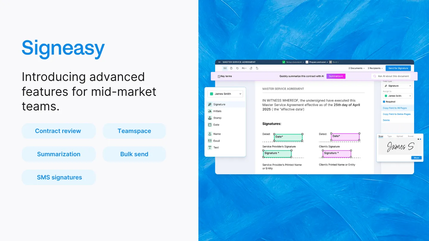
Our brand is an extension of who we are and what we believe in. Today, we would like to announce two small but meaningful refinements we have made to our brand ‘Signeasy’.
SignEasy is now Signeasy
As a brand, we stand for ‘easy’, and that’s what our product brings to you. We are making a tiny change to how the brand is typed or written with that goal in mind. Although small, it speaks volumes to the lengths we will go to make your life that much easier.
To type ‘SignEasy’, you have to use a shift key to capitalize the letter ‘E’ mid-way. Ironically, it is not easy to type the word ‘Easy’. Right?
Another problem is that computers often autocorrect our name to include a space between the two words: Sign Easy.
It’s a small thing, but small things matter to us. : )
With this change, when you recommend Signeasy to your friends on Twitter, remind signers on Whatsapp to sign a document, or write to us for help over email, easily type the name as one seamless word—Signeasy.
Breaking a pattern
Just because it’s a subtle change doesn’t mean we made the decision overnight! Over a decade, we observed that most of our customers, partners, and well-wishers, prefer to write ‘Signeasy’ and not ‘SignEasy’.
We have always intuitively felt we should listen to their choice and preference. And today, we have.
Many organizations in this industry have chosen to follow a trend of camel case (capitalizing the first letter of a word that forms the second element of a closed compound, e.g., PayPal, QuickBooks, TurboTax).
We are consciously choosing to break this pattern to be closer to our brand promise to you.
We are solidifying our intent with one more change—a brand new logo.
Signeasy’s brand new logo

The new logo is simple, straightforward, and honest. It is modern, and it reflects the personality of our product and our people. You may recognize the font used in the logo from NYC’s subway signs since they belong to the same family. And just like NYC’s iconic subway system, our logo will never feel dated. The Signeasy blue remains unchanged as it still represents our open, friendly, and helpful demeanor.
From today, you’ll see the new logo on our website, product, and emails. We will transform entirely in the next few weeks with the new logo featured across all touchpoints.
New logo, same us
We feel these changes are necessary for us to stay with the times, and they have brought us closer to our brand values. Our promise to you and the vision hasn’t changed. We will continue to serve you the way we always have (and, hopefully, even better).
Thanks for inspiring us to evolve and be a better version of ourselves.


