In a world that is fast digitizing, there are seldom original ideas that become a solution to a real problem. Three and a half years ago, I stumbled onto the idea for Signeasy while vacationing in Mexico. Back then, digital signature as a field was still in nascent stages. Since, the technology has matured and so have we. Over the years, we have reached over 2 million downloads on the App Store with more than 10,000 highly rated reviews. We have consistently been ranked in the top 50 grossing business apps. As a developer, we were happy except for one nagging itch (known to all developers) to be featured on the App Store.
Through the years, we have learned a lot about the App Store ecosystem through trial and error. In this post, I am going to share a few learning's that led to Signeasy being featured on the App Store on April 2nd, 2014.
As an app developer, being featured on the App Store is the Mecca of recognition. To be featured on the App Store, we took a two-pronged approach keeping the best interests of our customers and Apple at heart.
1. What does Apple want?
A unique and useful app that solves a real problem whilst adhering to the design standards set by Apple - a daunting task in itself. The basic idea of the exercise is to make sure that the app looks beautiful and performs exceptionally well on iOS devices.
2. What do our customers want?
We launched Signeasy in 2010 and as an early innovator in the mobile e-signature space, we took pride in what we had achieved. We always made it a point to listen to our customers to create an easier, simpler and secure app to sign documents on the go. We were successful and the fact was reflected in the amount of the high number of app reviews in the App Store.
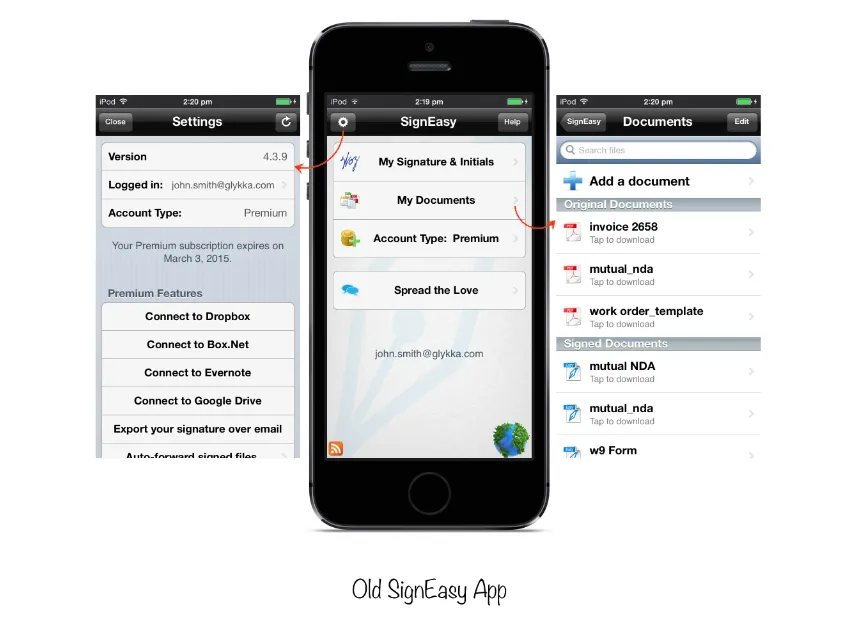
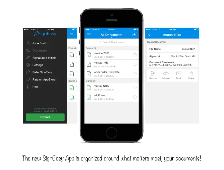
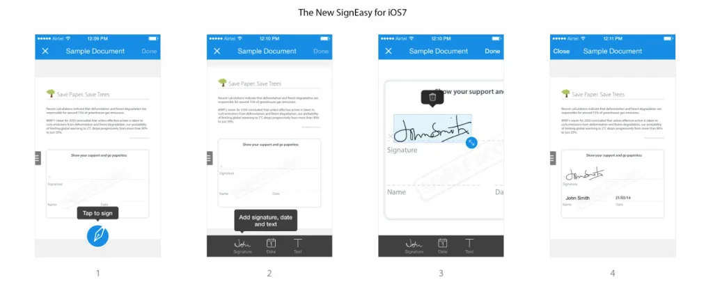
We were on top of our game in respect to productivity, but were lacking in the design paradigm. When iOS7 launched at the end of 2013, we took that opportunity to rebuild Signeasy from ground up to make it the simplest, fastest and most intuitive app ever built for people to sign paperwork effortlessly from their mobile devices. It took 5 months of effort with a cross-functional team involving designers, developers, product manager and support staff to re-imagine the signing experience for consumers and business professionals.
Here is how Signeasy looked before the release of iOS7* ready version:
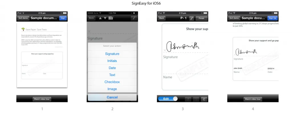
Here is how Signeasy looks now after the redesign for iOS7:
We knew this would be one of our best chances to get noticed by App Store editorial team for a promotion if we can reach out to them somehow through a referral, introduction or some secret connection (we even considered VooDoo) high up in the venture capital or media world. Unfortunately, nothing ended up showing us any light.
The Eureka Moment
I was brainstorming with friend of mine at RefreshApp, he suggested that I search for App Store Managers on LinkedIn and reach out directly. A simple search query gave me a result of potential App Store Managers. After identifying a couple of App Store Managers using the aforementioned LinkedIn query (category and geographic region wise), I sent them a brief pitch about Signeasy and our story of organic growth.
The two things that I took care off while communicating with the good folks at Apple were:
1) Establish our credibility
2) How our design ethos is helping customers take productivity to the next level
In a day or so, I got a response from Apple requesting me to setup a review meeting in 2 weeks. In the call, he went through the user flow of the app, suggested certain UI patterns to suit our user’s needs, pointed out few UX issues.
He was certain that if we could fix these issues and then resubmit the app, he would be in a position to recommend Signeasy to the editorial team. We were more than happy to oblige to his requests (In fact those changes made sense because at the end our users benefited from them) and resubmitted the app.
A couple of days went by, suddenly we received a request from iTunes for special artwork (required for an upcoming promotion). We had no idea of what would be coming our way. We were jittery and ecstatic at the same time, after 4 years of effort and post the 5th major App Update, we hoped (and prayed) that lady luck would finally come our way.
The update was approved and released on April 2nd, 2014, we hadn’t heard from Apple. Other developers had warned us about the secretive nature of Apple’s functioning and excepting a heads up about a promotion is not their style. And heck, we were not complaining.
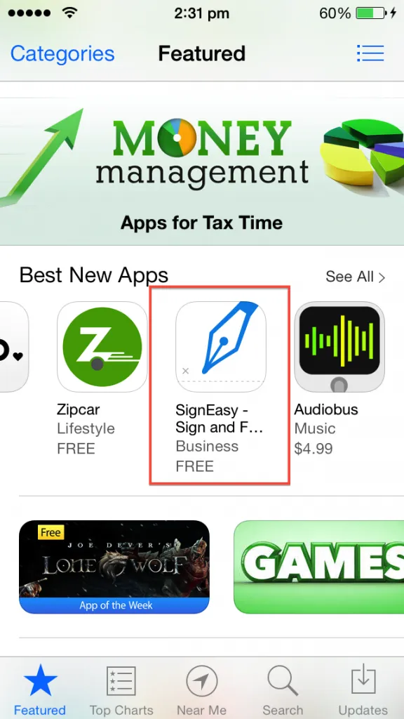
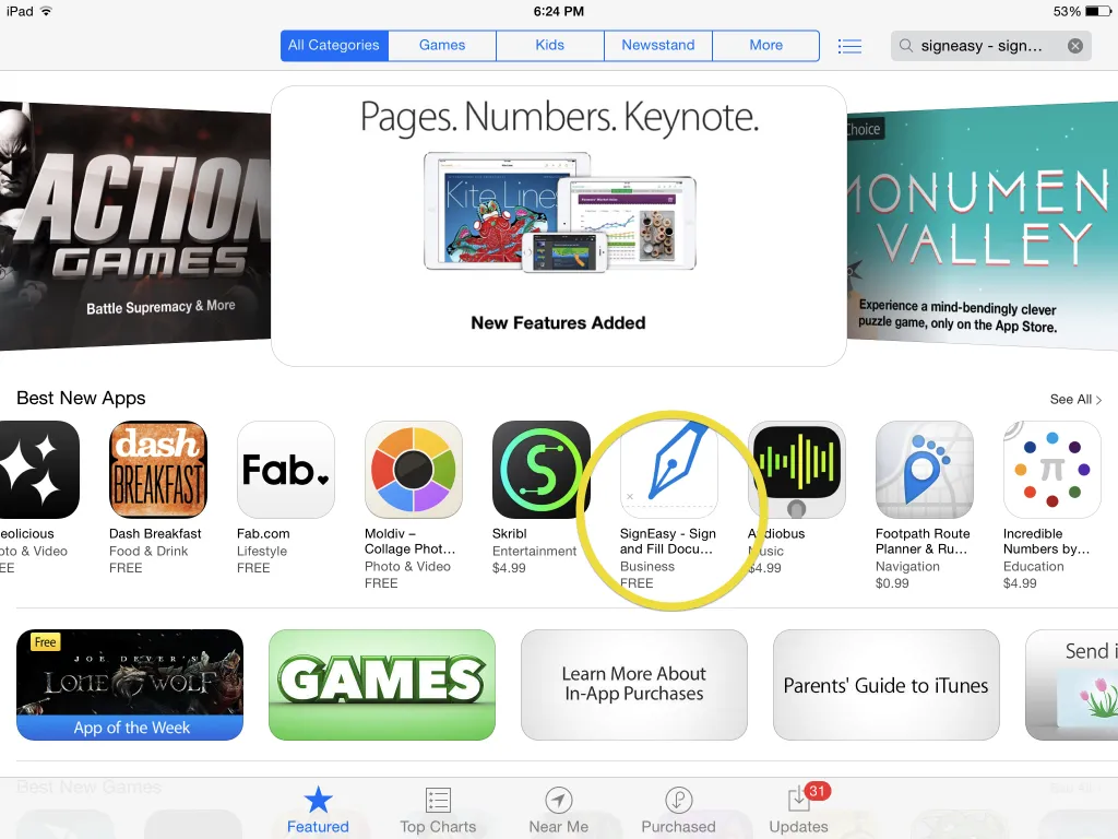
3rd April, 2014 was one of the best morning for me and the Signeasy team. A dear friend informed me that Signeasy was showing up in Best new Apps Carousel on the App Store homepage!
A surge of emotion, intense joy and the satisfaction of our achievement as a 10 member team bootstrapped without any external funding was fulfilling. Personally, I feel proud of our determination and attention to customer excellence that has let us build an app, which got recognized by Apple.
This was our learning from the App Store, we would love to hear your story, learn from your experience with the App Store. We are hopeful that the product app start-ups in India would benefit from these shared learning's.
In our next post, we will discuss the impact of being featured on the App Store. Stay tuned!
*WWDC 2014 saw the launch of iOS 8 and we are looking into it. Having the app updated is a prerequisite to customer satisfaction.


