Take it from us: you learn a lot after a decade in business.
Since the day Signeasy hit the market in 2010, we've been keeping our eyes and ears open to customer feedback, advancements in tech, and our team’s bright ideas. This blend of curiosity and desire to push the boundary is what led us to dream up Signeasy Mint, the best-ever version of our eSignature solution.
From a top-to-bottom interface refresh to a bundle of new high-performance features, here’s what’s new with Signeasy Mint after exactly one year, six months and fourteen days of workshopping.
Multiple documents, one signature request
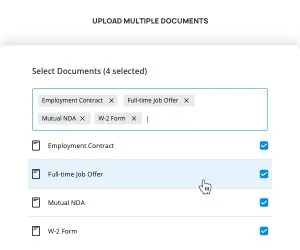
We’ve taken the classic manila folder online – a brand-new way to bundle documents together in a single signature request.
Previously, users had to send documents out for signature one at a time, whereas now, you can include up to 20 documents per request. This new feature makes things especially easy for tasks like employee onboarding, which might require a new hire to sign a contract, NDA, and offer letter all at the same time. Instead of sending them off one by one, you can create a nice clean “onboarding packet” with everything inside!
Revamped interface design
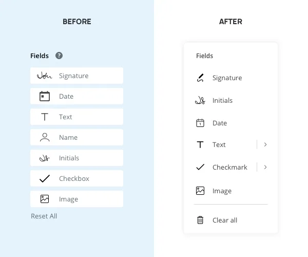
Have you ever let out a satisfied “ahhhh” after the first sip of an ice-cold drink? We want our user interface to deliver the exact same feeling.
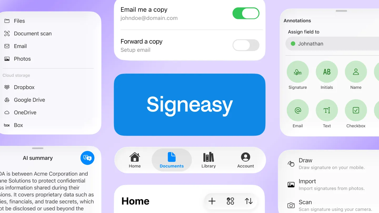
With Signeasy Mint, we said goodbye to our boxy, dated, grey-washed design, and switched it out for a supremely sleek look. It’s lighter on its feet, and gives users room to breathe – in short, it’s a serious glow up.
Easier field placement and dynamic resizing
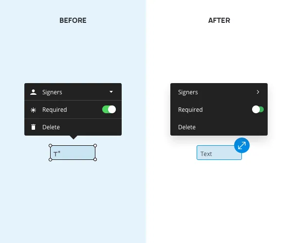
If you’re requesting someone’s signature, you’re bound to be using document fields. And you deserve the most seamless experience for this frequently used task.
In previous versions, users needed to drag each field by the corner to resize it. Things would often get glitchy, and if two fields overlapped, you would no longer be able to grab the corner to continue adjusting.
With Mint, the process is smooth as butter and hyper-responsive. Plus, certain fields (like text) are now dynamic, resizing automatically as content is added and removed. We also added the option to drag and drop fields into a document for our touch screen users, while maintaining the click and insert feature for anyone who wishes to use it.
Smart document thumbnails

During the Mint redesign, we ran into a game-changing question: what’s the point of a thumbnail if it doesn’t actually … preview anything? Before, our page thumbnails (when viewing multi-page documents) were too small to display distinct information from the text.
Not only are our new page thumbnails large and in charge, but they also display updated page content in real time and show a live counter of remaining fields to be filled in on the page . Whenever you add or remove a field, the thumbnail will update before your very eyes.
Going bold with field colors

If you’re creating a document intended for multiple signers, you’ll need different colors to keep track of who needs to sign where.
While our chosen shades used to be difficult to differentiate (and, admittedly, a little drab), Mint uses a collection of bold, distinct colors that make each signer’s role crystal clear.
We love keeping you in the loop about our new and exciting updates, but nothing compares to experiencing them for yourself. Give Signeasy Mint a spin today – then tell us what you think!
Watch the full Signeasy Mint feature video below ?


